
Start with a practical brief
Many new businesses delay branding because they assume every visual decision requires a professional designer from day one. Good design help is valuable, but early-stage teams often need something more basic first: a way to explore ideas, compare directions, and understand what kind of logo fits the brand before they spend money on refinement.
Testing logo ideas starts with a short brand brief. Write one sentence about what the business does, one sentence about who it serves, and three words that describe the desired feeling. For example, a neighborhood bakery might choose warm, handmade, and friendly. A cybersecurity consultant might choose precise, calm, and reliable. These words become a filter for judging every visual option.
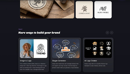
The next step is to try different logo categories. A wordmark can work well when the business name is memorable. A symbol can help when the brand needs a compact icon for apps, labels, or social profiles. A combination mark can give a new company flexibility because the name and symbol can be used together or separately. Testing more than one category prevents the team from choosing the first idea simply because it is available.
Compare options in realistic contexts
A free AI logo creator can be useful at this stage because it allows quick exploration without committing to a final design budget. The goal is not to generate a finished identity in one click. The goal is to create enough variety to see which direction feels credible, distinctive, and practical for the audience.
Once there are several options, place them into realistic contexts. Put each logo at the top of a simple website mockup. Shrink it to the size of a mobile header. Try it on a business card, invoice, profile picture, or product label. A logo that looks exciting in isolation may become confusing when it has to live beside text, navigation, images, and calls to action.
Feedback should also be structured. Instead of asking people which design they like, ask what kind of business they think each logo represents. Ask which one feels most trustworthy, which one is easiest to remember, and which one seems least clear. These questions produce more useful answers than a simple vote. They help reveal whether the visual direction communicates the intended message.
Budget-conscious teams should avoid chasing too many trends. Gradients, mascot styles, retro lettering, and abstract symbols can all work, but only when they serve the brand. If a design depends completely on a trend, it may need to be replaced too soon. Simple shapes, readable type, and strong contrast usually last longer and are easier to adapt across channels.
Refine the strongest direction
After testing, choose the direction that performs best in real situations, then refine it. Adjust spacing, simplify details, improve contrast, and prepare clean file versions. If the business later hires a designer, these early tests become a useful brief instead of wasted work. The designer can see what was explored, what failed, and what customers responded to.
A limited budget should not stop a business from making thoughtful brand decisions. With a clear brief, fast experiments, and practical testing, founders can move from vague ideas to a confident visual direction long before they invest in a full design project.